Introduction
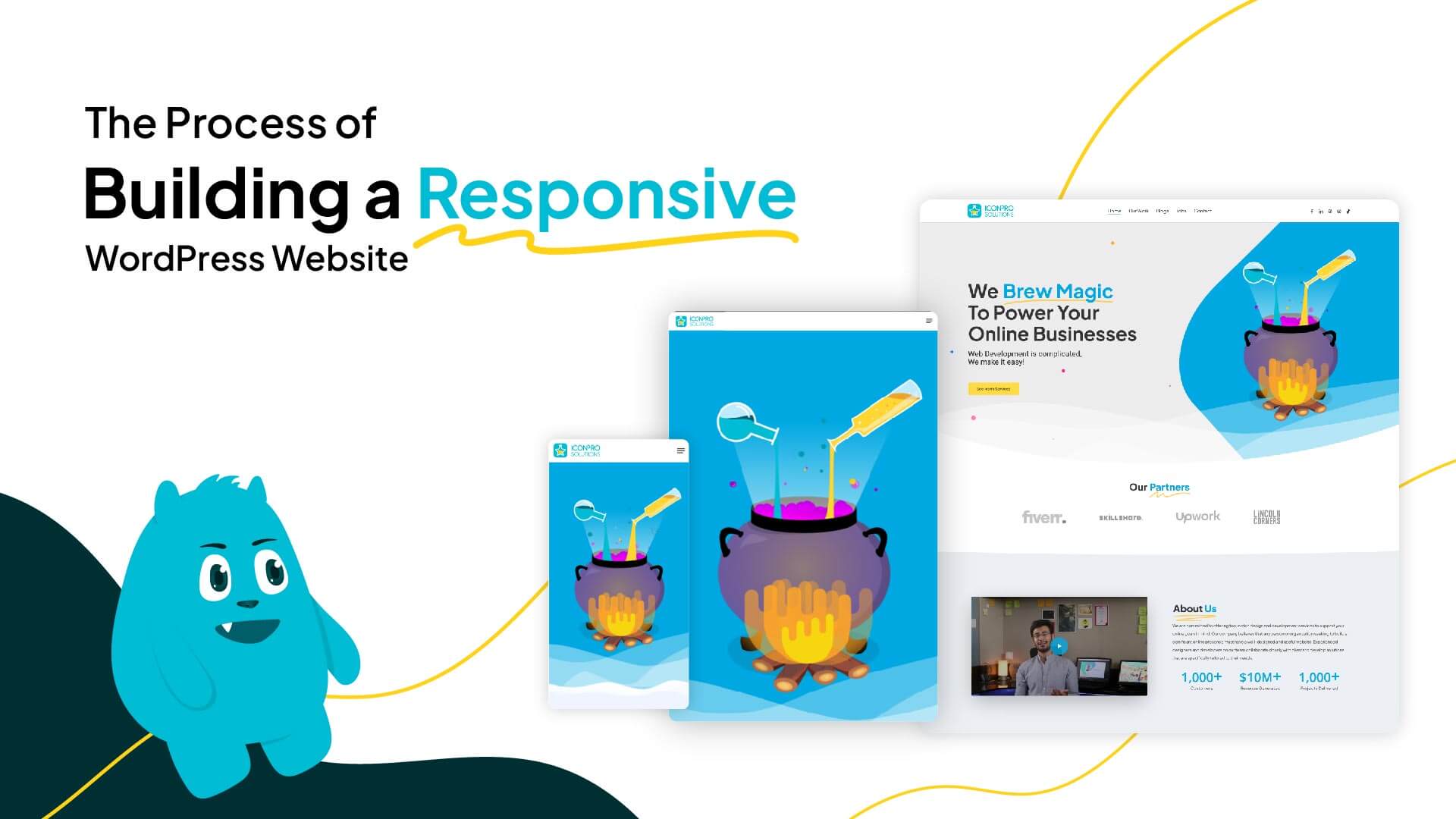
Embarking on the journey of building a responsive WordPress website is a multifaceted endeavor that requires careful planning, strategic execution, and an understanding of the intricate processes involved. In this blog post, we’ll take you behind the scenes, unveiling the step-by-step process of creating a responsive WordPress website. From conceptualization to deployment, join us on a journey through the stages that contribute to crafting a website that adapts seamlessly to various devices and delivers an exceptional user experience.
Project Planning and Strategy
1. Define Your Goals
Clearly outline the objectives of your website. Whether it’s an informational blog, e-commerce platform, or portfolio site, defining your goals is the foundation for a successful project.
2. Identify Your Target Audience
Understand your target audience’s preferences, behaviors, and devices they use. This knowledge will inform design and functionality decisions to create a tailored experience.
3. Choose a Responsive WordPress Theme
Selecting a responsive theme sets the tone for your website’s adaptability. Explore themes that align with your brand and offer the flexibility needed for customization.
Design and Wireframing
1. Sketch Your Layout
Develop a rough sketch or wireframe of your website’s layout. Consider the placement of key elements such as headers, navigation menus, content areas, and footers.
2. Focus on User Experience (UX)
Prioritize user experience by ensuring intuitive navigation, clear calls-to-action, and a design that guides users through the content seamlessly.
3. Mobile-First Design
Adopt a mobile-first mindset during the design phase. Start with the mobile layout to prioritize content and functionality for smaller screens.
Development and Coding
1. Set Up a Development Environment
Create a local development environment or use a staging site to build and test your website before deploying it to the live server.
2. Responsive Coding Practices
Implement responsive coding practices, such as using media queries, flexible grid layouts, and fluid images, to ensure your website adjusts gracefully to different screen sizes.
3. Test Across Devices
Regularly test your website on various devices and browsers to identify and address any responsive design issues. This iterative testing process is crucial for a flawless user experience.
Content Integration and Optimization
1. Add Engaging Content
Populate your website with high-quality, engaging content that aligns with your brand and resonates with your target audience.
2. Optimize Images and Media
Compress and optimize images to ensure fast load times. Use responsive images that adapt to different screen resolutions for an optimal viewing experience.
3. SEO Best Practices
Implement SEO best practices, including keyword optimization, meta tags, and mobile-friendly design, to enhance the visibility of your website in search engine results.
Testing and Quality Assurance
1. Cross-Browser Compatibility
Test your website across various browsers (Chrome, Firefox, Safari, etc.) to ensure consistent performance and appearance.
2. Functional Testing
Conduct thorough functional testing to identify and fix any bugs, broken links, or issues that may affect user interactions.
3. Performance Optimization
Fine-tune your website for optimal performance by minimizing code, leveraging browser caching, and ensuring fast load times.
Deployment and Launch
1. Choose a Reliable Hosting Provider
Select a reliable hosting provider that can accommodate the specific requirements of your WordPress website, including responsiveness and speed.
2. Domain Configuration
Configure your domain settings and ensure a smooth transition from the development environment to the live server.
3. Monitor and Iterate
Once launched, continuously monitor your website’s performance, user feedback, and analytics. Use this data to make iterative improvements and updates.
Conclusion
Building a responsive WordPress website is a dynamic process that involves careful planning, creative design, meticulous development, and continuous improvement. By taking a behind-the-scenes look at each stage, you gain insights into the intricacies of crafting a website that not only meets but exceeds the expectations of your audience. As you navigate this journey, remember that the true magic lies in the seamless blend of design, functionality, and responsiveness that brings your digital presence to life.
“Stay connected with us for the latest updates and insights on software development trends. Follow us on social media and visit our website for more!“
???? Website: Icon Pro Solutions
???? LinkedIn: Icon Pro Solutions on LinkedIn
???? Facebook: Follow us on Facebook
???? Dribbble: See our work on Dribbble
???? Instagram: Follow us on Instagram


