Let’s Recap
In the last blog, we discussed some important UX principles and their real world examples.
Which one seemed most interesting to you? Now Think about how they are used in designs and see what characteristics makes a design good or bad.
Exploring the Impact of Good and Bad Design
In the field of design, examples are excellent sources of instruction, displaying both the successes and failures that result in user experiences. By researching instances of both good and bad design, we can get valuable insights into what works and what doesn’t. In this post, we’ll look at three examples of good and terrible design to show how effective design could enhance user experiences.
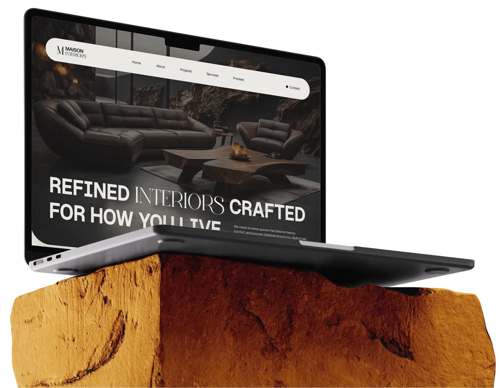
The Power of Good Design
Good UX design is more than just aesthetics; it’s a strategic tool that may help businesses develop. Here are five examples of the transforming power of good design.
- Distinctive Branding:
Sleek and professional designs can distinguish businesses, attract users, and build brand loyalty.
- Positive First Impressions:
A website that is well-designed functions as a digital storefront, providing visitors with a positive first impression and paving the path for long-term consumer connections.
- Seamless Navigation
Intuitive website navigation improves the consumer journey, resulting in a smooth and engaging browsing experience that keeps users interested and satisfied.
- Consistent Branding
Consistency promotes familiarity. Nothing highlights this more than Google’s signature font colors, which enhance brand identification and trustworthiness.
- Enhanced User Actions
Good design does more than just look good; it also guides users towards their preferred activities, enabling digital goods to reach their full potential and maximize user engagement.
Identifying Bad Design
Design is just as important as recognizing good design, as it acts as an indicator for designers looking to make a good impression. Here are five common features of terrible design that can undermine user experiences and hurt businesses:
- Confusing Layouts
Cluttered and disorganized layouts overwhelm users, hindering their ability to find information and navigate effectively. Clear and structured layouts are essential for guiding users toward their goals with ease.
- Poor Readability
Text that is illegible or poorly formatted frustrates users and detracts from the professionalism of a design. Legible fonts, adequate spacing, and appropriate sizing are paramount for ensuring readability across all devices.
- Lack of Functionality
Designs lacking essential features or functionality impede user engagement and satisfaction. Prioritizing user needs and optimizing functionality are imperative for delivering seamless and rewarding user experiences.
- Unattractive Appearance
Outdated or unappealing designs tarnish brand image and drive users away. A visually pleasing design with modern aesthetics reinforces brand credibility and encourages user trust.
- Failure to Meet Expectations
Designs that fail to align with user expectations or address their needs result in disappointment and disengagement. Understanding user preferences and tailoring designs accordingly is essential for fostering user satisfaction and loyalty.

In the ever-changing universe of design, examples of both good and terrible design serve as beacons of guidance, illuminating the route to producing meaningful and compelling user experiences. By using the lessons learned from these instances, designers may enhance their profession and lead the road for design innovation and excellence.