Let’s Recap!
In the last blog, we learned and identified the basic difference between UI and UX of a design, and discovered how educational background and additional certifications affect a design career.
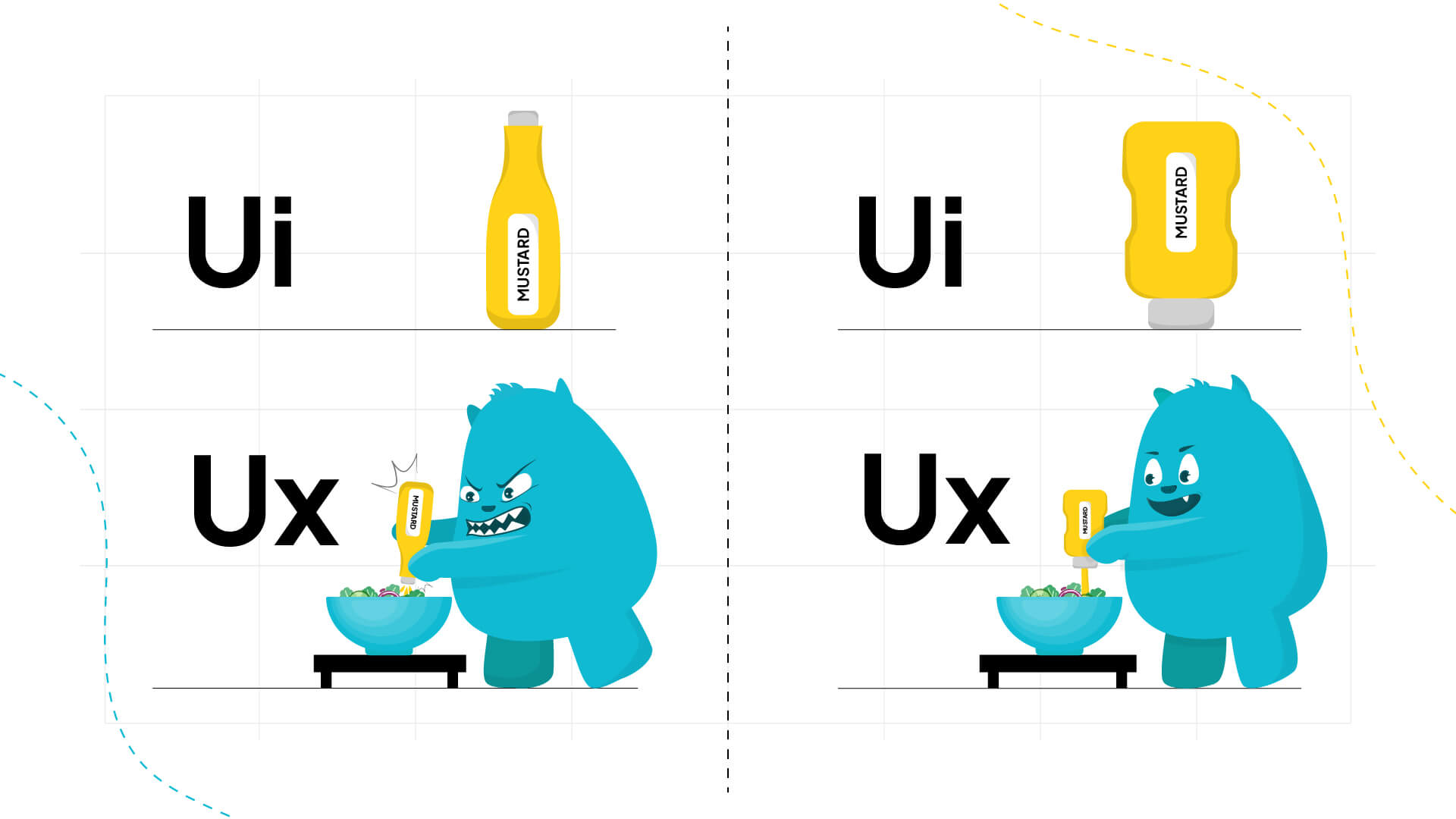
Remember this example from the last blog?
The meme uses a ketchup bottle to contrast two scenarios and shows a well designed label with difficult squeezing, demonstrating strong UI but bad UX. The other depicts a basic label with easy squeezing, indicating weak UI but strong UX. It wonderfully emphasizes the significance of both UI visual appeal and UX usability for effective product design.
Now Let’s Dive into Design!
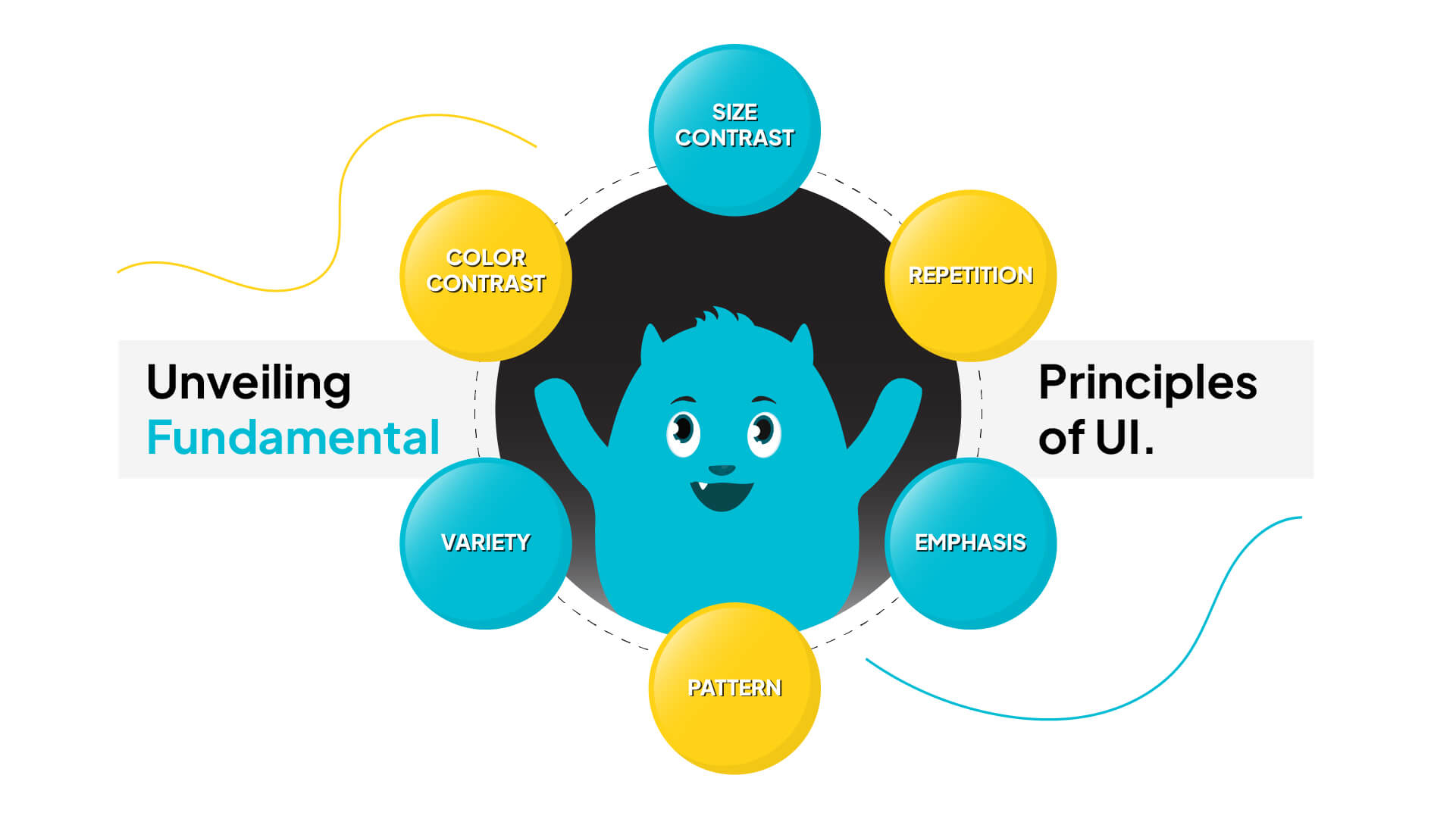
Unveiling the Fundamental Principles
Hello, fellow design enthusiasts! Welcome to our exploration of the intriguing realm of design principles. Have you ever wondered what makes a design visually appealing and cohesive? No need to ask any longer! Join us as we uncover the mysteries behind some fundamental design concepts and how they influence the aesthetics of everything from logos to websites.
- Balance: Finding Your Design Zen
It’s time to talk balance. Imagine a seesaw; if one side is heavier than the other, it would tip, right? The same goes for design. Finding that sweet spot ensures that our designs seem sturdy and harmonious, whether it’s symmetrical balance, which distributes everything uniformly, or asymmetrical balance, which adds some flavor with uneven features.

- Unity: Bringing It All Together
Now let’s talk about unity. Consider unity as the glue that keeps your design together. When colors, typefaces, and forms work together, the result is a coherent appearance that tells a narrative without saying anything.

- Contrast: Making Things Pop
Contrast is like a splash of spice in your favorite meal; it adds intrigue! Contrast, whether through vivid colors, varied font sizes, or varying textures, allows certain pieces to stand out while keeping the overall design balanced and lively.

- Emphasis: Putting the Spotlight On
Now let’s focus on emphasis. Similar to bolding crucial language in an essay, emphasis draws attention to vital areas in our designs. Whether it’s a bright color, a bigger text size, or a strategically positioned image, emphasis directs the viewer’s attention and informs them where to look first.

- Repetition: Keeping Things Consistent
Repetition is all about consistency. It’s like creating a beat in music that keeps you moving. Repeating patterns, forms, or colors across your design adds a sense of coherence and familiarity, tying everything together.

- Pattern: Adding a Splash of Style
Patterns are like the icing on the cake of design – they add texture, interest, and personality. Whether it’s a traditional stripe or a unique geometric print, patterns provide visual interest and make our designs stand out.

- Rhythm: Going with the Flow
Rhythm in design is similar to a well-choreographed dance; it leads the viewer’s attention effortlessly from one piece to the next. By intentionally repeating and altering graphic components, we create a feeling of movement and flow, keeping our designs interesting and dynamic.

- Proportion: Finding the Right Fit
Proportion is all about balance and harmony, much like Goldilocks selecting the ideal chair size. Proportion guarantees that everything feels exactly right, regardless of the size of the pieces or their location within the design.

- Variety: Spicing Things Up
Variety is the spice of design life.It keeps things interesting and draws our viewers back for more. Whether we’re blending colors, textures, or styles, diversity gives depth and character to our creations.

Conclusion:
And there you have it – a quick overview of some essential design ideas! Understanding and applying these ideas to our own work allows us to create visually amazing designs that captivate and inspire. So go ahead, experiment, and let your imagination soar!
Stay connected with us for the latest updates and insights on software development trends. Follow us on social media and visit our website for more!”
???? Website: Icon Pro Solutions
???? LinkedIn: Icon Pro Solutions on LinkedIn
???? Facebook: Follow us on Facebook
???? Dribbble: See our work on Dribbble
???? Instagram: Follow us on Instagram