Introduction
In the dynamic landscape of web design, the nuanced interplay of colors and fonts transcends mere aesthetics, serving as powerful tools that shape user experiences and define brand identities. This comprehensive guide delves deep into the art and science of color psychology and typography, unraveling the profound impact of these design elements on website aesthetics, functionality, and overall user engagement.
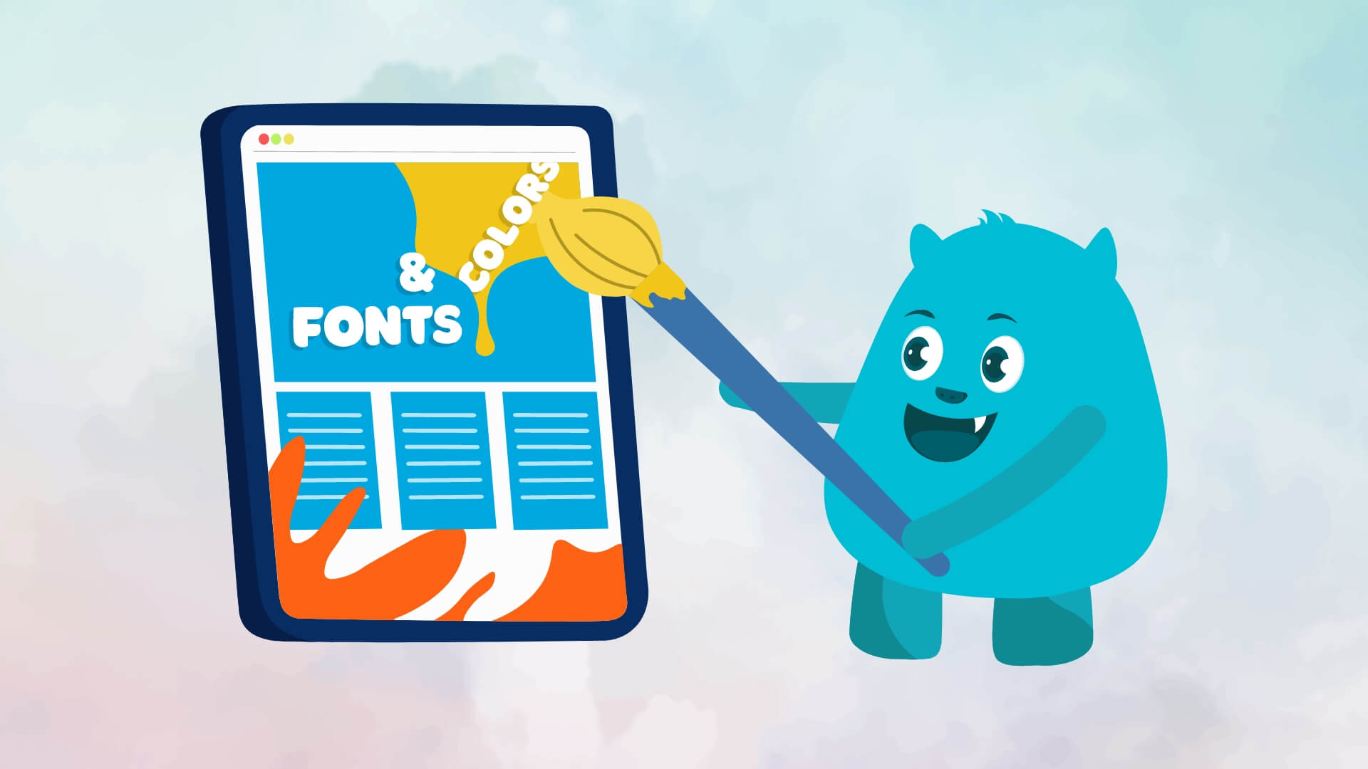
The Power of Color Psychology
Colors are not merely visual embellishments; they are potent instruments that evoke emotions, convey messages, and influence user behavior. Commence by deciphering your brand’s identity and the emotions you aim to elicit. Warm tones like red and orange infuse vibrancy and energy, while cool blues and greens evoke a sense of calm and trust.
The crucial role played by color psychology is emphasized while designing, as users’ perceptions, emotions, and behavior can be significantly influenced by it. Different feelings and reactions are evoked by different colors, and the overall user experience on a website can be enhanced by understanding how to use color effectively.
Creating a cohesive color palette is paramount. Leverage tools like the Adobe Color Wheel to craft harmonious combinations, and ensure accessibility by considering color contrast ratios. A well-curated color scheme enhances aesthetics and guides users seamlessly through the website’s various sections, contributing to a memorable and enjoyable user journey.
Typography: Beyond Words
Fonts are the silent narrators of web design, conveying personality, setting the tone, and impacting readability. Begin by selecting fonts aligned with your brand identity—whether a sleek sans-serif for modernity or a classic serif for a touch of tradition.
Maintain typographic hierarchy using different font weights and sizes for headings, subheadings, and body text. This not only enhances readability but also guides users through the content effortlessly. Choose clean and readable fonts for body text, ensuring a pleasant reading experience across diverse devices. The overall aesthetics, readability, and user experience of a website is immensely affected by the selection of fonts and typography.
Optimizing for SEO
While the impact of colors might not affect the SEO directly, but it sure does indirectly. To improve your online visibility, it’s important to incorporate SEO best practices into your color and font strategy. To ensure readability, make sure that the text contrasts effectively with the background. Additionally, it’s recommended that you use descriptive filenames for images, and take advantage of alt text to insert relevant keywords. This will not only improve accessibility but also boost your search engine rankings.
Conclusion
In the symphony of web design, colors and fonts orchestrate the melody that resonates with your audience. The deliberate integration of color psychology and typography in web design is an effective instrument for not only creating visually appealing layouts, but also for creating a seamless and memorable user interaction, developing a lasting link between the audience and the content.
By unraveling the psychology behind these choices and implementing them strategically, you not only enhance the visual appeal of your website but also craft a memorable and impactful user experience that lingers long after the visit.
“Stay connected with us for the latest updates and insights on software development trends. Follow us on social media and visit our website for more!”
???? Website: Icon Pro Solutions
???? LinkedIn: Icon Pro Solutions on LinkedIn
???? Facebook: Follow us on Facebook
???? Dribbble: See our work on Dribbble
???? Instagram: Follow us on Instagram